Black Caviar - Houston
Black Caviar - Houston
CLIENT: Reajunir
LOCATION: Houston, TX
SIZE: 1,600 SQ FT
OPENING: 2014
PROGRAM: Retail
curvature and tension: reinterpreting the human skin
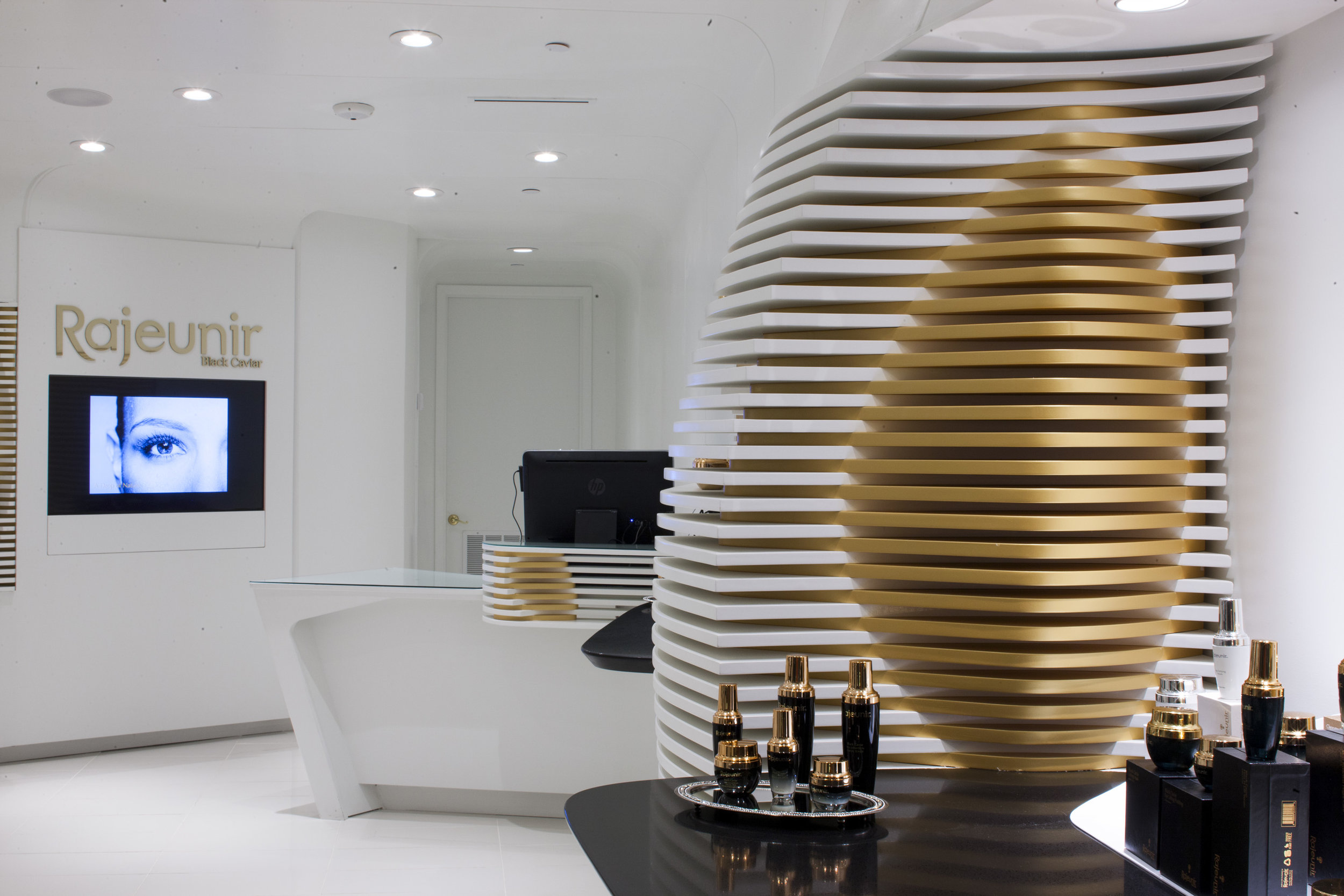
Reajunir Black Caviar is a young cosmetics start up featuring a line of high-end skin care products. The store at GalleriaI in Houston, Texas is the first out of more than 100 stores being planned for the next 10 years. The brief given by the client was clear: to develop a scheme that aesthetically would set apart the store’s appearance from its competitors. Our inspiration came from an attempt to translate the human skin into the smooth and curvilinear surfaces of the walls.
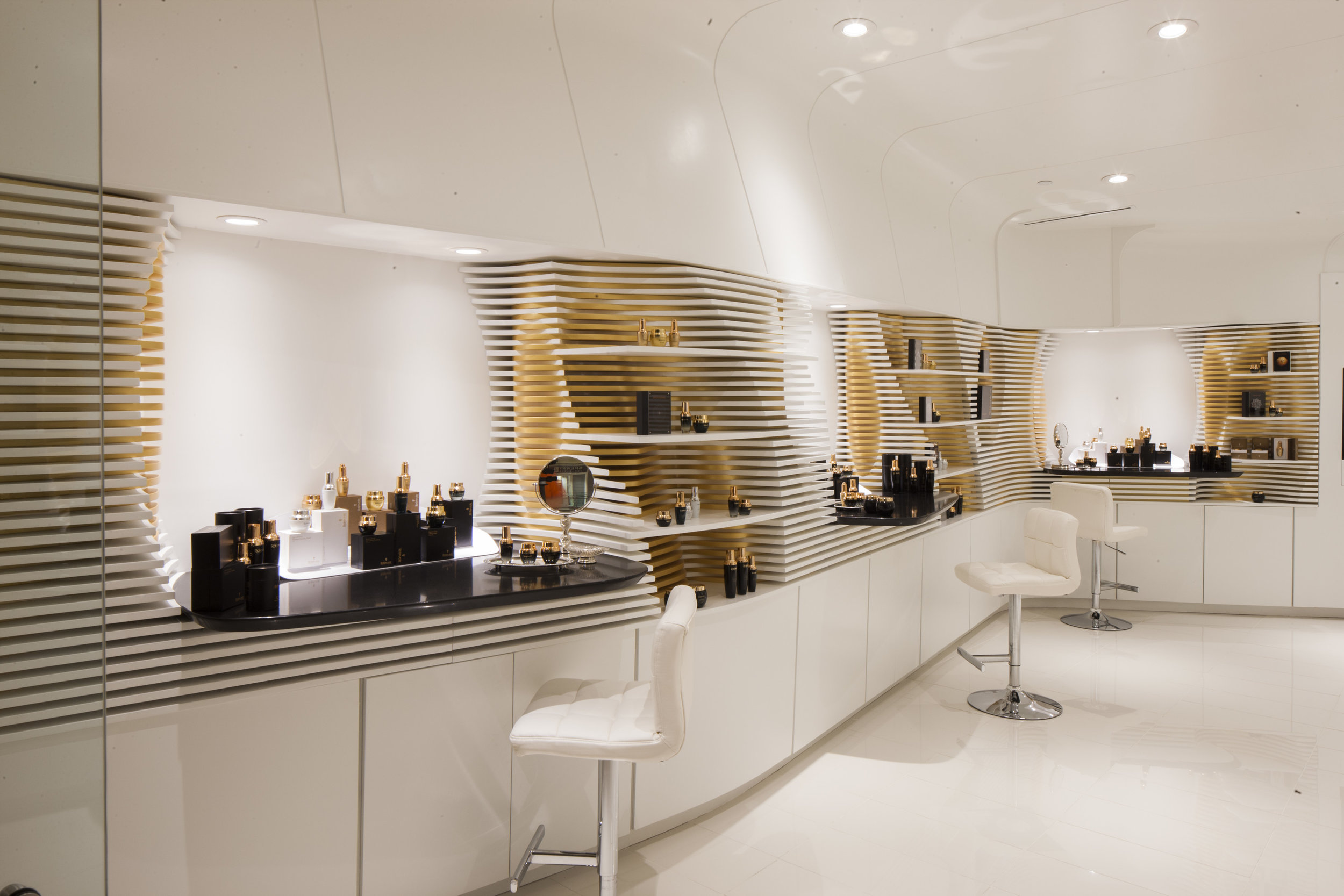
Ceiling and wall surfaces are in a continuous flow blurring the traditional notion of how vertical and horizontal surfaces interface in a conventional retail space. The walls have oval voids that work as product display zones, and as demo stations for customers.
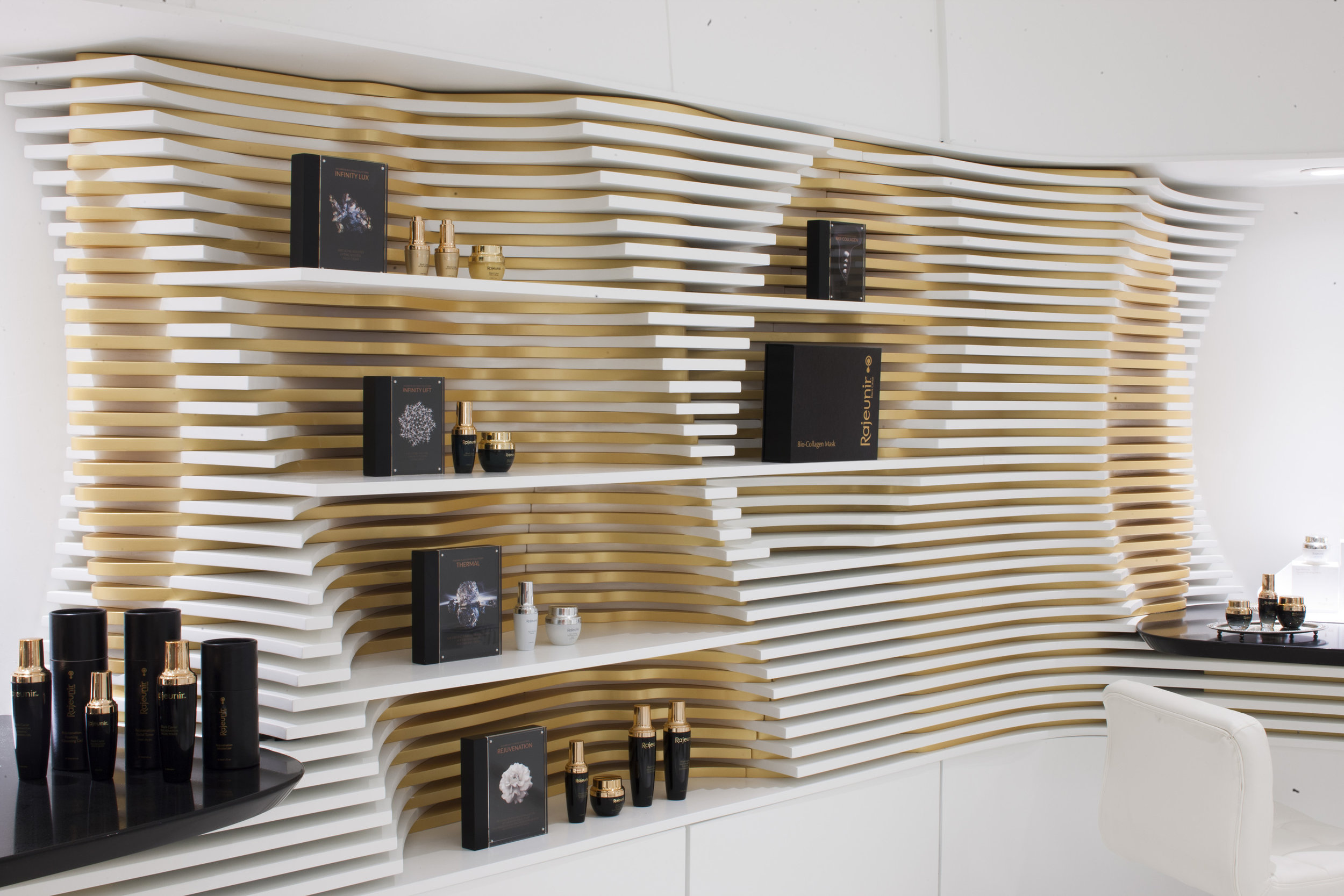
Modern digital fabrication methods allowed two dimensional white and gold surface panels and their substructure to be prefabricated off site in a controlled environment, then shipped and installed on site. This provided for maximum control over the end product, making it more cost effective, faster to produce and construct, and also aesthetically refreshing.
our process
To further develop the concept created for the store, we worked closely with several experts throughout the design process. Our first focus was in finding an ideal partner with extensive experience in parametric design development, which we needed in order to create the curvature of the interim skin. This relationship had to be symbiotic, pushing our team to remain flexible and responsive to the challenges of the design. We also looked for, and then found the ideal digital fabrication shop that could cut the CSC and routing of the detailed elements in the way the design called for.
At concept, we worked very closely not only with the client himself, but also with his marketing director and business development group to establish the criteria essential to the products' brand. This first prototype store was meant to help define the identity of the company, in a brick-and-mortar context that was new to them. The aesthetic of the store was an essential part of the branding and identity process.


